Want to see all four new Preds logos? Well, they’re right here…
- Updated: June 22, 2011

At the 2011 NHL Awards, the Nashville Predators gave the four traveling media members (all bloggers, by the way) the opportunity to see the new logo for the first time.
All of the pictures below are the new logos you’ll see on Preds sweaters next season. And, if you’re wondering, the new jersey will be unveiled at the NHL Draft on Friday. We’ll have pics of that too so stay tuned.
.
.
.
.
.
.
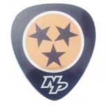
The SECONDARY LOGO. This will replace the skull shoulder patch on the current sweaters. The idea is, obviously, the three stars of the Tennessee flag and a guitar pick-shaped outer design. Pretty awesome.
The ABBREVIATED MARK logo. This will not only be seen on Pekke Rinne’s new mask but also on the pant legs of all Preds next season.
The WORD MARK is just the “Nashville Predators” written out with the same color scheme as the logo (obviously) and with a slight font change.
The PRIMARY LOGO is pretty self explanatory. It’s the same basic logo but without all of the random colors in the original. This one is down to three. The indigo blue (?), the gold and the white. Nothing more. If you know anything about printing and silkscreening and the like then you know that a basic color set is a lot easier to print. And cheaper. And “cleaner.” A pretty nice update in my opinion. Especially the way other teams are starting to design more “basic” logos (see: the Tampa Bay Lightning).


Pingback: Nashville Predators Unveil New Logos » SportsLogos.Net Blog
Pingback: OPISO » Pass or Fail: The new logos for the Nashville Predators